Color is one of the most powerful elements in interior design, capable of transforming spaces, influencing moods, and expressing personality. Yet for many homeowners, selecting the right color palette feels overwhelming—with seemingly infinite options, how do you choose hues that will create harmony and reflect your unique style? In this comprehensive guide, we'll walk through the process of creating a perfect color palette for your Pakistani home that balances traditional influences with contemporary sensibilities.
Understanding Color Psychology: The Emotional Impact of Colors

Before diving into specific color combinations, it's important to understand how different colors affect our emotions and behaviors. While cultural associations vary, certain psychological effects of color are relatively universal:
- Blue - Promotes calm, tranquility, and concentration; ideal for bedrooms and offices
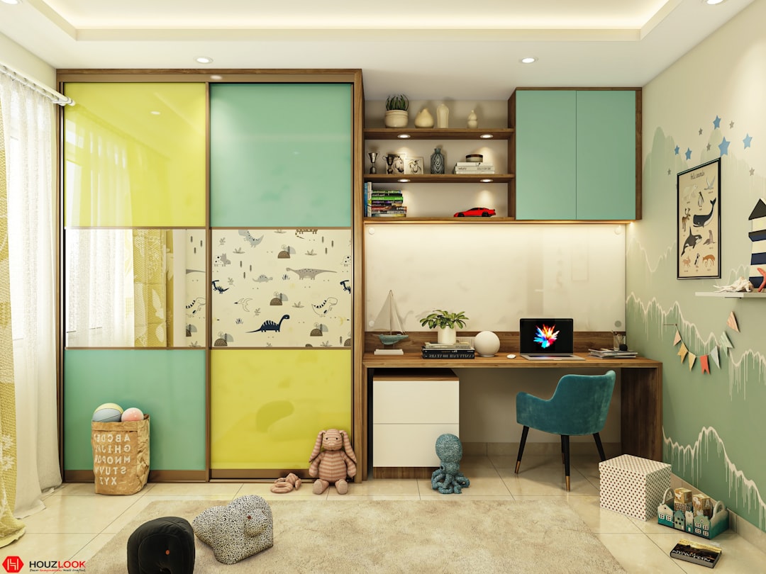
- Green - Evokes nature, balance, and renewal; perfect for creating restful environments
- Yellow - Stimulates optimism, energy, and creativity; works well in kitchens and creative spaces
- Red - Energizes, stimulates appetite, and creates excitement; effective as an accent in dining areas
- Purple - Suggests luxury, spirituality, and creativity; adds sophistication to formal spaces
- Orange - Blends yellow's cheerfulness with red's energy; creates a welcoming, convivial atmosphere
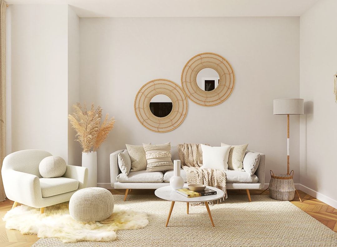
- Neutrals (white, beige, gray) - Provide breathing room, create sophistication, and showcase architecture
In Pakistani homes, where vibrant colors have traditional significance, understanding these psychological effects helps balance cultural preferences with the desired atmosphere in each room.
Assessing Your Space: Working with Light, Architecture, and Flow

Your home's physical characteristics significantly influence which colors will work best. Before selecting a palette, carefully evaluate:
Natural Light
The quality and direction of natural light dramatically affect how colors appear:
- North-facing rooms receive cooler, bluish light that can make colors appear muted. Warm tones like terracotta, gold, and cream can counterbalance this effect.
- South-facing rooms enjoy warm, consistent sunlight that enhances most colors. You have the flexibility to use both cool and warm tones effectively.
- East-facing rooms receive bright morning light that turns softer as the day progresses. Warm colors will glow in morning light, while cooler tones provide balance in the afternoon.
- West-facing rooms experience strong afternoon light with warm, orange tones. Cool colors can help balance the intense afternoon warmth.
Architectural Features
Consider how your color choices will highlight or downplay your home's architectural elements:
- Use contrasting colors to emphasize beautiful moldings, arches, or decorative details
- Apply the same color to walls and trim to minimize awkward transitions or dated elements
- In homes with traditional Pakistani architectural features, choose colors that complement rather than compete with intricate woodwork or stone details
Room Flow and Continuity
Create a cohesive feeling throughout your home by considering:
- How rooms connect visually, especially in open floor plans
- Transition spaces like hallways and staircases
- Sight lines from one room to another
For the typical Pakistani home with interconnected spaces and indoor-outdoor living areas, maintaining color continuity is especially important for creating a harmonious environment.
Finding Inspiration: Sources for Your Perfect Palette
Inspiration for your color palette can come from numerous sources. Consider these starting points:
Look to What You Love
- Your wardrobe - The colors you choose to wear often reflect your personal preferences
- Meaningful artwork - A favorite painting can provide a ready-made palette
- Family heirlooms or textiles - Traditional Pakistani textiles often feature beautiful color combinations
- Nature - From Pakistan's varied landscapes, from mountain vistas to coastal scenes
Consider Fixed Elements
Build your palette around elements that won't be changing:
- Flooring materials and colors
- Stone or brick features
- Cabinetry and countertops
- Large furniture pieces you plan to keep
Digital Tools and Resources
Take advantage of technology to explore color combinations:
- Color palette generators like Coolors or Adobe Color
- Paint company apps that let you visualize colors in your space
- Pinterest boards for collecting and organizing inspiration
- Instagram accounts of Pakistani interior designers showcasing local color trends
Building Your Palette: The 60-30-10 Rule

A balanced color scheme typically follows the 60-30-10 rule, which creates visual harmony while allowing for interest and accent:
- 60% - Dominant color: Usually applied to walls and large furniture pieces, this forms the backdrop of your design
- 30% - Secondary color: Used for furniture, textiles, and select walls, this adds visual interest without overwhelming
- 10% - Accent color: Reserved for accessories, artwork, and small details, this adds personality and visual punch
For Pakistani homes that traditionally embrace more vibrant color, you might adjust this to include multiple accent colors or more saturated secondary colors while maintaining the general distribution principle.
Types of Color Schemes: Finding Your Style

Color theory offers several classic approaches to combining colors harmoniously:
Monochromatic
Using different shades, tints, and tones of a single color creates a sophisticated, cohesive look. This approach works beautifully in Pakistani homes to showcase textural elements like carved wood, stone, or metalwork. Example: Various shades of terracotta from light to deep, creating a warm, enveloping space.
Analogous
Combining colors that sit adjacent to each other on the color wheel creates a harmonious, natural feel. This scheme works well in spaces where you want to create a serene atmosphere. Example: Combining peacock blue, teal, and emerald green for a refreshing palette reminiscent of traditional Pakistani ceramics.
Complementary
Pairing colors from opposite sides of the color wheel creates dynamic energy and visual interest. This approach works best when one color dominates while the other serves as an accent. Example: A predominantly ivory room with rich purple accents, creating a regal atmosphere.
Triadic
Selecting three colors equally spaced around the color wheel creates a vibrant, balanced scheme. This approach suits spaces where you want energy and visual richness. Example: Combining saffron yellow, deep teal, and russet red for a palette inspired by traditional Pakistani textiles.
Neutral with Accents
Building a base of neutrals with carefully chosen accent colors creates a timeless foundation that can evolve over time. This approach is popular in contemporary Pakistani interiors that balance tradition with modernity. Example: Warm whites and beiges with accents of indigo blue and brass.
Regional Considerations: Pakistani Color Traditions

Pakistan's diverse regions each have distinctive color traditions that can inspire contemporary palettes:
- Punjab - Rich reds, oranges, and golds reflecting the region's agricultural heritage and vibrant celebrations
- Sindh - Blues and greens reminiscent of water and ceramics, often paired with earthy neutrals
- Khyber Pakhtunkhwa - Deep indigos, terracottas, and rustic browns reflecting traditional textiles and architecture
- Balochistan - Sun-baked earth tones punctuated with vibrant embroidery colors
- Northern Areas - Cool blues, greens, and purples inspired by mountain landscapes and lapis lazuli
Incorporating these regional color traditions into your palette creates spaces that honor cultural heritage while meeting contemporary aesthetic preferences.
Room-by-Room Approach: Tailoring Colors to Function
Different rooms serve different purposes and benefit from specific color considerations:
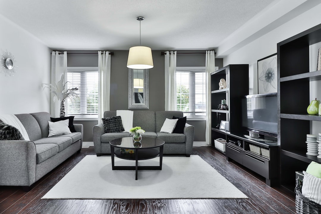
Living Areas
As gathering spaces for family and guests, living areas benefit from welcoming, versatile palettes. In Pakistani homes, where hospitality is paramount, consider:
- Warm neutrals with rich accent colors for a timeless approach
- Earthy tones that create warmth and encourage conversation
- Cultural accent colors that can be updated through textiles and accessories
Bedrooms
These personal retreats should promote rest and relaxation:
- Cool blues, soft greens, and lavenders for their calming properties
- Muted versions of warm colors if you prefer a cozier atmosphere
- Limited accent colors to reduce visual stimulation
Kitchens
The heart of Pakistani homes deserves special color consideration:
- Classic whites and neutrals for a clean, timeless look that showcases food
- Warm spice tones like saffron, turmeric, or cinnamon for energy and appetite stimulation
- Cool blues or greens to balance the heat generated by cooking
Dining Areas
Colors that enhance conviviality and appetite work best:
- Rich, warm tones that create an inviting atmosphere
- Dramatic deeper colors for evening-focused dining spaces
- Subtle patterns that add visual interest without competing with food presentation
Bathrooms
Consider both function and atmosphere:
- Spa-like blues and greens for their associations with water and cleanliness
- Crisp whites and neutrals for a clean, classic approach
- Rich jewel tones for powder rooms used primarily by guests
Testing Your Colors: Avoid Costly Mistakes
Before committing to your color palette, take these essential testing steps:
- Use sample pots to paint large swatches (at least 1 meter square) on multiple walls
- Observe the colors at different times of day and under both natural and artificial lighting
- View samples alongside your existing furnishings to ensure harmony
- Consider the finish - matte, eggshell, satin, or gloss - as this affects how the color appears
- Test complete combinations of your dominant, secondary, and accent colors together
These testing steps are particularly important in Pakistan's varied climate zones, where light quality can differ dramatically between coastal, desert, and mountain regions.
Implementation Tips: Bringing Your Palette to Life
Once you've finalized your color palette, consider these strategies for implementation:
Start Small
If you're uncertain about color, begin with a smaller room or introduce your palette through:
- Accent walls rather than entire rooms
- Textiles like cushions, rugs, and curtains
- Artwork that incorporates your palette
Consider Visual Weight
Remember that colors have different visual impacts:
- Darker colors tend to advance (appear closer) and make spaces feel more intimate
- Lighter colors recede and create a sense of spaciousness
- Bright, saturated colors draw attention and can dominate a space
Plan for Longevity
Create a palette with staying power by:
- Using more timeless colors for expensive, permanent elements
- Reserving trendy colors for easily changed accessories
- Considering how your palette might evolve over different seasons and years
Conclusion: Creating Your Personal Color Story
The perfect color palette for your Pakistani home is one that reflects your personality, respects your home's architecture, functions appropriately for each space, and creates the atmosphere you desire. By understanding color theory, honoring cultural influences, and following a thoughtful selection process, you can create a harmonious color scheme that transforms your house into a warm, inviting home.
Remember that the most successful interiors often evolve over time. Start with a well-considered foundation, but allow your palette to develop as you live with it and as your tastes mature.
At WeAllthStarter, we offer personalized color consultation services to help you navigate this process. Our designers understand both international color trends and Pakistani cultural contexts, allowing us to help you create a palette that feels both current and authentic. Visit our showroom to explore our curated furniture and decor collections designed to complement a wide range of color schemes.